My Fashion Blogger Apartment Tour! Mid-Century modern minimalist home decor, furniture, interior design.

Welcome to my apartment! For the first time, I’m revealing this intimate tour of my living quarters. I’m overjoyed with how the interior decor came together, creating an environment that feels 100% “me.”
Ready to see how a fashion / travel blogger decorates her home? Come on in, and I’ll take you through each room.
(Each item of furniture or decor is highlighted in this house tour. At the end, there’s a summary of the items — along with design tips for maximizing a small living space.)
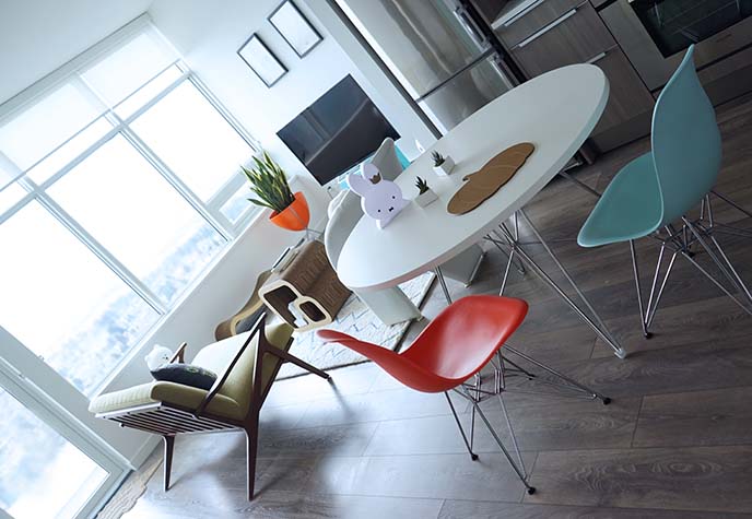
I’m a design-nerd, so let’s begin with the aesthetic concept. I’d sum up the apartment with four “M-words”:
Mid-Century Modern – Minimalism – Marie Kondo – Miffy!
1. Mid-Century Modern. I’ve long admired the mid-20th century design movement, which emphasizes organic / geometric forms and modernist clean lines. My high-rise one bedroom apartment in Vancouver has giant windows and a balcony, which bring in lots of natural light — a must for “MCM” homes.
I chose a mid century color scheme for the entire space: tangerine orange, aqua (light turquoise or teal), and avocado green. I also looked for furnishings reminiscent of this era, made with space-age white, steel wire, and natural wood.
2. Minimalism. I’m naturally drawn to minimalist aesthetics, especially Japanese Zen and Scandinavian modern. However, minimalism also has a key function in small spaces: it keeps the environment from feeling cluttered and claustrophobic.
I significantly pared down my belongings, and carefully chose beautiful pieces that served multiple functions — such as a coffee table that is also a cat scratcher, multi-purpose chairs, and lamps that double as sculptures.
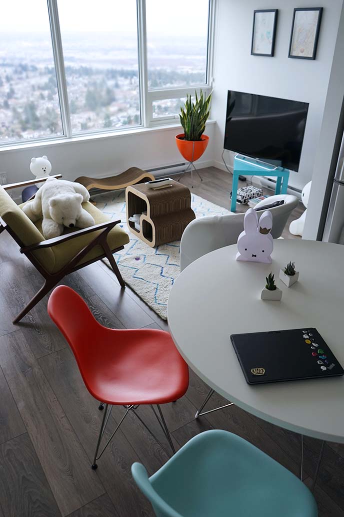
3. Marie Kondo. If you follow me on social media, you’ll know I have been in decluttering mode (my items are for sale here)!
However, in another way, the Japanese “Konmari” method has made an impact on my choices. “Sparking Joy” sounds a bit silly, but I realized I wanted every part of my home to reflect what makes me happy. And so, I’m surrounded by items that have meaning: favorite cute characters, souvenirs from travels, mementos and art from friends. That leads us to…
4. Miffy! I’m mad about the Dutch bunny, created by Dick Bruna as a children’s book character. Miffy (or Nijntje) also happens to be a minimalist design from the mid twentieth century (she debuted in 1955), which ties together all of the above points.
Now, it’s time for the apartment tour! I’ll take you around, and end with decorating tips for small condos and apartments.
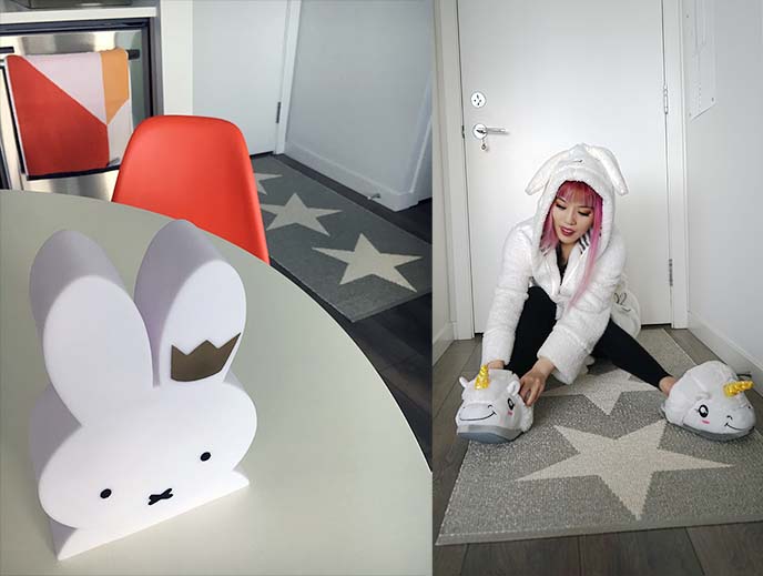
The happiness begins when you walk through the door, and onto this starry rug from Scandaffaren, purveyors of Scandinavian modern design.
The bold, geometric stars make you feel as if you’re on the Hollywood Walk of Fame. This slim runner (long rug) is also strong and waterproof: making it the perfect entry mat.

Scandaffaren‘s online shop has an eye-catching selection of home goods made in Sweden, Norway, Denmark, and Finland: modern, cutting edge designs that are impossible to find in regular furniture stores.
For instance, Scandaffären has a large selection of Swedish rugs in various sizes, colors and patterns. They sent me this Papellina Viggo Metallic Stone / Vanilla Star rug, which immediately conveys the minimal, pop culture mood of my apartment.

The unique design is reversible, so I can choose between metallic grey or white as the base color. (I plan to switch it up, since both look lovely.)
Pappelina’s rugs are made in Sweden from environmentally-aware materials: 90% plastic foil ribbon, and 10% warp thread. These durable materials are woven together by hand in the traditional Swedish method: on looms that date back to the 1950s.
These rugs are made be trodden on by Vikings. They require minimal care, and the color and quality don’t fade.

With this rug, I feel like I’m making a grand entrance every time I come in. My hardwood floors have a grey undertone, which complements the Viggo Star Stone Metallic shade. The geometric forms also harmonize with the other pieces in the apartment, including the towels, chairs and lamps (which will be described later on in this post).
Scandaffaren’s Pappelina rug may have three stars… but it gets a 5-star rating from me!

You might notice that I chose a longer runner, as opposed to the standard “welcome mat” size. People often forget that they need room to close the door and take their shoes off. At 28 x 60 inches, this one gives enough space for several people to comfortably step in, and undo their laces.

Big up to Scandaffaren for elevating my entry-way. They’re an independent company, which I love to support, and have a wonderfully curated selection of Scandinavian / Finnish designs.

Based in Devon, Pennsylvania, they’re the only US retailer for several Swedish brands. If you’re in North America, this is the place to get your hands on Scandinavian home decor — here is their website.
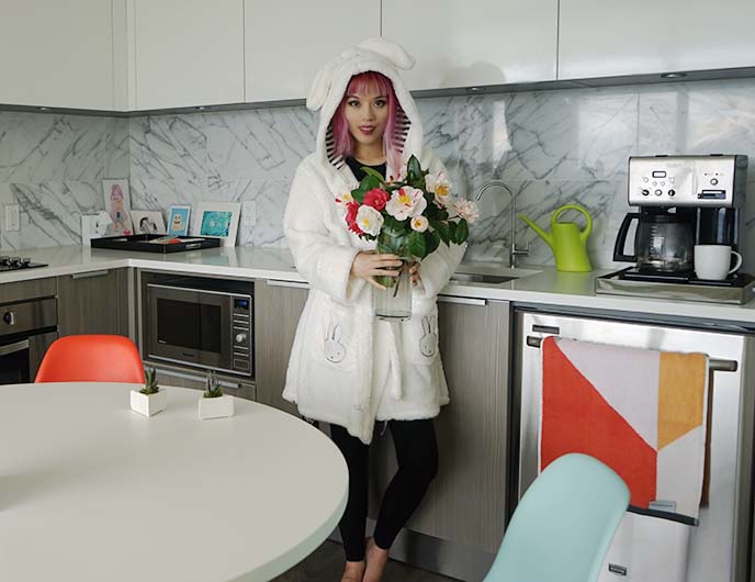
Now, let’s move into the kitchen. (“Thanks for the flowers! Can I make you a cup of tea?”)
The cooking area is small, but there’s plenty of counter space, with large cupboards that hide equipment and utensils. All the external objects are stainless steel for a unified look.
You’ll notice my little decor elements that “spark joy”: illustrations and cards from friends, tiny succulents in white triangle pots, a geometric hand towel by Sunday Minx (more about them below, in the bathroom section.)

As Halloween-loving Goth, I always smile when I see my pumpkin-shaped coaster / placemat. In fact, this is a cutting board from Crate and Barrel.
Don’t be afraid to get creative, and use objects for purposes other than their original intent.
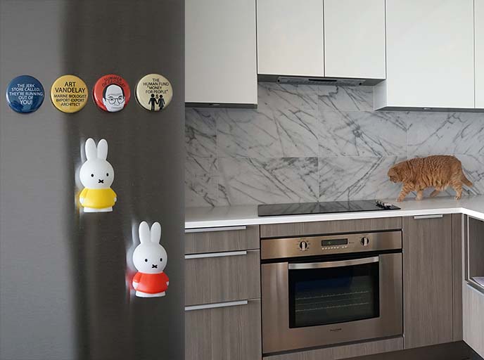
“These are a few of my favorite things.” The fridge holds magnets featuring George Costanza from Seinfeld, and Miffy the rabbit. And look who is working the cat-walk… Basil!
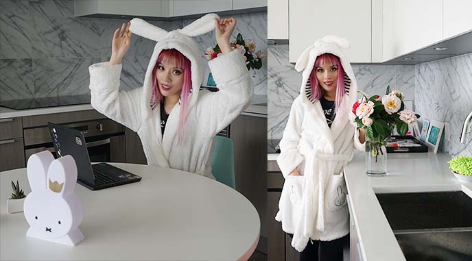
I spend a lot of time in this cozy white Miffy bathrobe. The robe has bunny ears and embroidered pockets, and was a gift from my cousins in the UK.
My minimalist centerpiece is this exact Miffy Cotton On lamp. It’s visually appealing, and also a useful portable light.

Little apartments can only have limited amounts of furniture — so I encourage you to choose carefully, and invest in a few quality pieces.
Anyone who loves modern design knows the name Herman Miller. This American furniture manufacturer rose to fame during the 1940s-60s, producing iconic pieces such as the Aeron chair, Noguchi table, Marshmallow sofa, and Nelson bench. Today, they remain the leaders in modernist, experimental home furnishings. (See examples below, and click for more info.)

I acquired a pair of Eames molded plastic side chairs. I’m sure you recognize this design, as it’s one of most famous manufactured by Herman Miller.
When you order an Eames chair, you can customize the material, upholstery, color, base and finishing. I went for the Aqua Sky and Orange hues, with chrome-finished steel wire legs and a standard glide base.
Charles and Ray Eames are the American design gurus behind this chair. When the first Eames chair came out in the late 1940s, it was a sensation (for the first time, molded fiberglass could create a curving, one-piece seat).
Many stores sell knockoff “Eiffel chairs,” but I encourage you to honor the designers and save up for the real deal. If you compare these with replicas, you can see an enormous difference in the finishing and quality. (Shop for authentic Eames dining chairs below.)
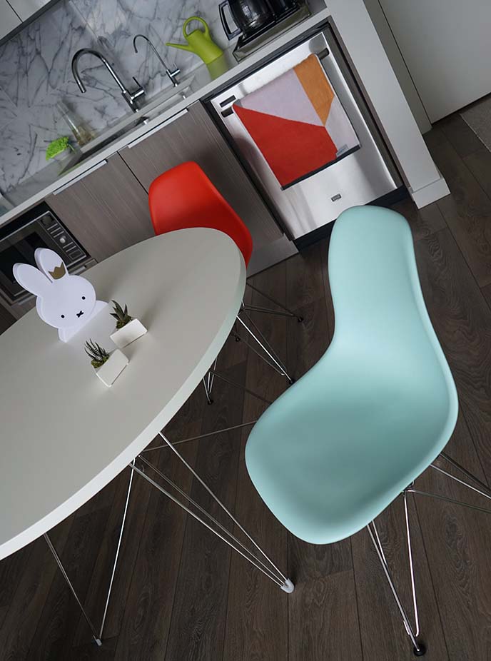
I paired my seats with this Tavolo XZ3 table, also from Herman Miller. Once again, you can customize the shape and legs — I went for the round white tabletop and chrome legs.
The Tavolo XZ3 is an in-house design by Magis, the Italian furniture brand that makes designs by Jasper Morrison and Philippe Starck. The table material is a study white MDF with polymer cover, and the angled legs are made of steel rods.
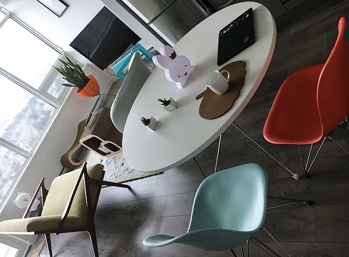
My round Magis Tavolo doubles as a work desk (for writing, cooking, etc) and dining table. As you can see, the legs go perfectly with wire-based Eames chairs. Plus, the floating effect keeps the small apartment from feeling crowded.
The photos speak for themselves: Herman Miller is the mid-century and contemporary furniture master. Pro tip: if you are a qualified interior designer or architect, you can get a significant “designer’s discount” on their products.
Below are more designs to inspire you (click to view).

Shall we mosey over to the living room? There are cute, fuzzy white animals waiting to sit with you…

… including my stuffed polar bear from Korea. (I’m trying to be a bunny to fit in.)

There’s no cozier place to catch up on shows, read a book, or gaze out the window at the spectacular view (I’m on a high-level floor).
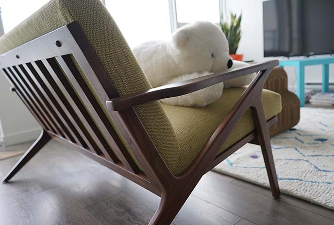
I’m in love with this retro sofa: the Cavett Loveseat by Crate and Barrel. The sleek lines capture the feeling of mid-century modernism — particularly the American walnut frame and tapered legs.
The cantilevered seat, angular arms and striped wood slat back are attractive from every angle. My Cavett love seat is so comfortable to curl up on, with built-in upholstered cushions. (You can chose from a variety of fabric finishes; mine is the Lemongrass green).
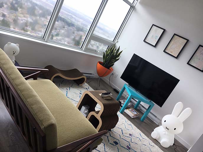
This elegant sofa is the perfect choice for smaller spaces. A longer, overstuffed, bulky couch would overpower the room.
Head over to the Crate and Barrel website, and search for “Cavett Loveseat” to find this timeless piece. Hint: C&B also has an architect / designer trade discount program, which takes 10% off the total.
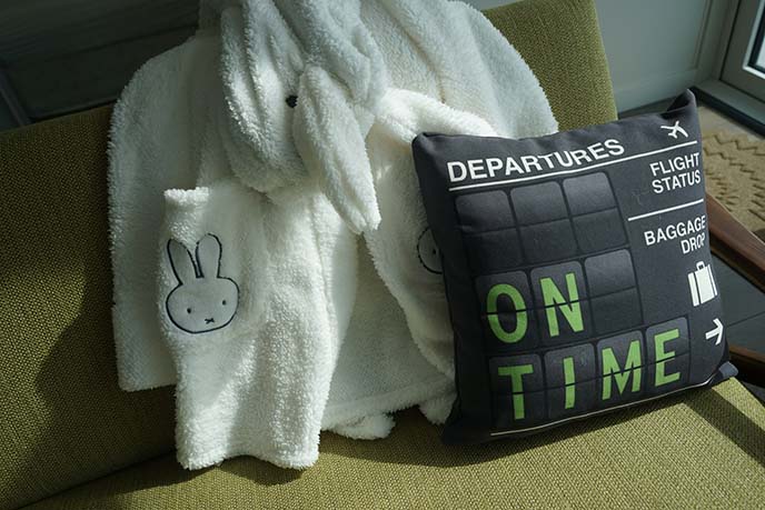
The lemongrass green sofa pairs well with my Departures pillows from Airportag. Their travel-inspired home goods are made for globetrotters like me — Airportag has accessories, posters, cups, tote bags featuring airport codes from around the world.

The retro flip-board look also fits in with my mid-century modern vibe. These pillows are soft and fluffy to lean on… like a certain Scottish Fold cat!
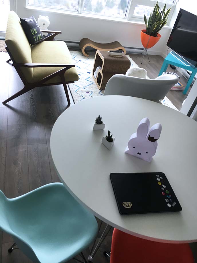
Here’s another look at how the living and dining spaces flow together.
When you have limited square footage, a harmonized color scheme / aesthetic can help make the rooms look bigger (as opposed to creating separate areas with different looks). Notice how the orange and blue chairs match the planter and table, and everything has a unified mid-century modern look.
If you like this style of furniture, take a look at Herman Miller and Crate and Barrel for much more.

In tiny homes, multi-function modular furniture is key. (That is, pieces that can be moved around and used according to changing needs).
Case in point: this lightweight white leather chair (similar to this one) can be an extra living room seat, a dining chair, or a window perch for Basil!
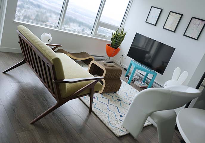
The “coffee table” is another modular piece: it doubles as a cat scratcher, made by Kitticraft!
I didn’t want a TV stand or console, as these tend to be chunky-looking. I simply painted my family’s Ikea “Lack” table from the 90s, to match the exact shade of blue in my color scheme. (Ikea’s furniture quality was much better in the 1990s, and used real wood. I don’t recommend getting their current fiberboard and particleboard products).

Above the television, there are three paintings that “spark joy” like nothing else. They’re by my artist friend Naomi Rubin, and based around memories of our adventures together.
You can read more about these paintings here and see detailed scans, as well as more of her art on Instagram @naomiyaki.
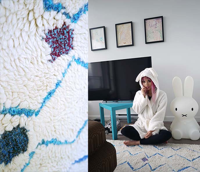
My white and blue zig-zag carpet is as as soft as it looks… it’s a hand-tufted Moroccan shag from Rugs USA!
Choosing a primarily white carpet with a simple pattern helps to make a room look more spacious. The blue zigzag is a minimalist take on the geometric carpets from the mid-century modern era. (The close-up shows the detail that goes into each tuft, and the multiple hues of blue in the design.)

My carpet is the “Marrakech Hand Tufted Spotted Moroccan Zigzag Shag Rug” that comes in blue or red, and various sizes (mine is 5 x 8′). It’s currently on sale at Rugs USA, if you’re looking for a great deal.
(It matches this sardine dish that my friends got for me in Portugal. I use it to hold the TV remote).

Rugs USA.com has thousands of chic carpets in all sizes and styles, from contemporary to old-school to funky. They carry most of their rugs in-house, which means they ship fast within the US and Canada (mine arrived in a week).
They’re a celebrated retailer, and I was pleased with their selection, prices, and customer service.
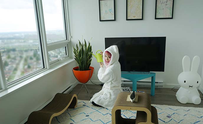
It’s a joy to sit on this lush carpet! You can see how the zigzag vertical lines draw one’s eye towards the view, and the light color makes the room look larger.
My windows provide plenty of sunlight for my snake plant, Sansevieria trifasciata. This is “the” modernist plant, and it’s easy to keep (snake plants require little light and watering).
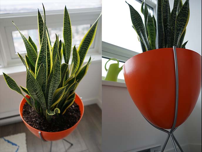
My Sansevieria sits in this magnificent orange Retro Bullet Planter, from Hip Haven!
Hip Haven is an Austin-based designer, creating home accessories and lights inspired by mid-century modernism. Everything is made in-house, with the highest quality materials and craftsmanship.
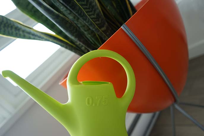
First manufactured in the 1950s, “bullet” style planters reflected the American fascination with the space age. Advancements in plastics also let designers create light, durable furniture with curves for the first time (such as my Eames chairs.)
Hip Haven pays homage to this timeless yet futuristic design, with a colorful curved planter nestled in a steel tripod stand. Doesn’t it look ready for take-off?
(My watering can is by Eero Aarnio, designer of the 1960s “ball chair” – another MCM masterpiece.)
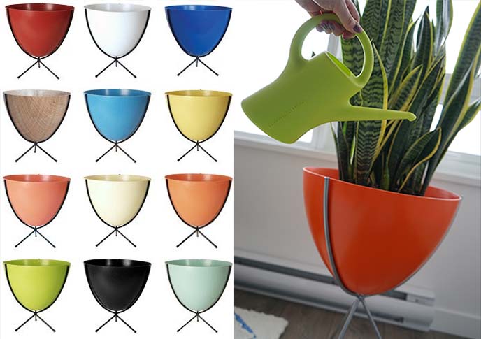
I adore Hip Haven’s playful, contemporary twist on designs from the Atomic Age.
When you order a Retro Bullet Planter, you can customize the bowl color, stand height (16, 23, or 30 inches) and finish. (Mine is the medium size, in hot orange, with silver powder coat). They have a mini version of this planter as well (great for table plants), and other original home goods on their site.

I’m all for supporting independent designers with a heart, and Hip Haven is all of the above. The owner, Kelley Sandidge, founded her company out of her passion for mid-century modern decor.
She debuted the bullet planters to great acclaim, and now has expanded to decorative screen doors, fiberglass side chairs, lighting collections, and more. If you’re looking to spruce up your home with vintage-influenced accessories, give Hip Haven a look.

Hello, Brown bear from Line Friends! My Dutch designer friends MrMaria are responsible for this sweet lamp.
I have the Mr Maria Brown small lamp for reading and mood lighting. It uses fire-safe LEDs and has a dimmer, which lets me adjust the light depending on the situation.

And how can I resist their most iconic design, the Miffy XL lamp?
The MrMaria family includes an elephant, polar bear, smiley face, Japanese doll, and glowing white heart. When you order one from their site, you can select any type of voltage plug, and even pick up replacement modules.

Modern, minimal, “kawaii” cute… serving both form and function. No wonder Mr Maria is one of my favorite designers on the planet.
(In an upcoming post, I’ll show you my visit to their studio in Amsterdam.)

Many people overlook the bathroom as an area for interior decoration — but it has lots of creative potential. By choosing beautiful towels and bath accessories, you can elevate this utilitarian space.
I transformed a small bathroom with these luxurious towels by Australia’s Sunday Minx. As you can see, the colors are consistent with the rest of the apartment.

Believe me, these are not “regular” hand and bath towels. They feel like silky, fluffy clouds!
Sunday Minx exclusively uses 100% Turkish cotton with extra long natural fibers, which results in an incredibly soft, thick fabric. The long cotton loops are quick-drying and super absorbent, and the colors will last through time.

I was excited when I came across Sunday Minx’s towels. Their geometric patterns and colors add playful sophistication to a typically drab area of the home.
Sydney-based Brooke Rudzis founded Sunday Minx in 2015. This young label is gaining buzz worldwide for its bold prints and vibrant approach; everything is designed in Australia, and made in Europe.
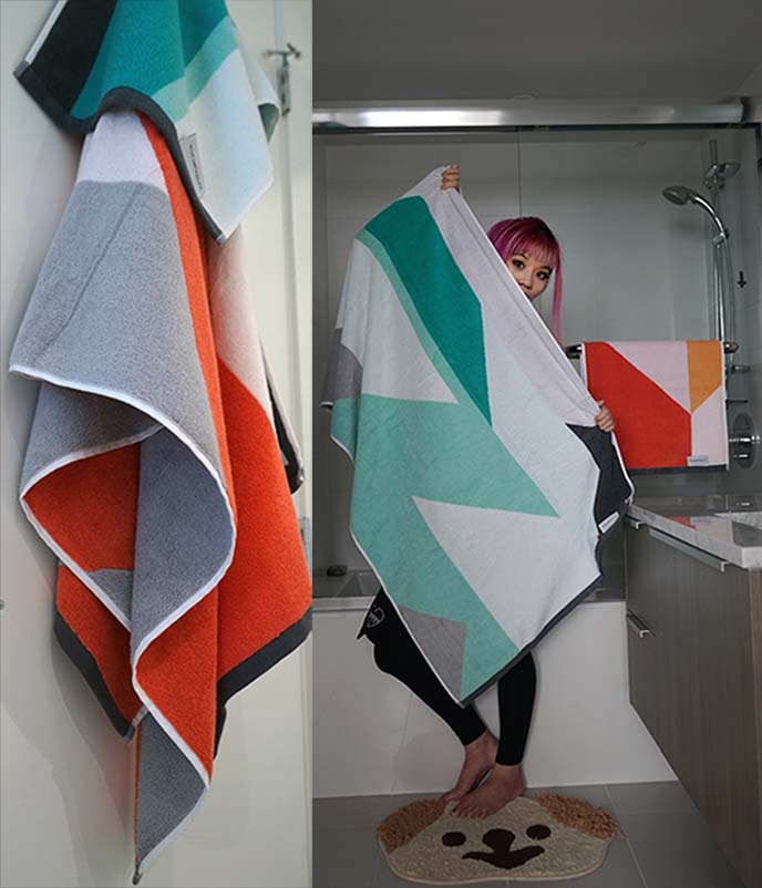
My four towels are from their recent collection, inspired by the post-modernist designs of the Italian-based Memphis Movement. Sunday Minx encapsulates this non-conformist vibe with bright hues and geometric patterns.
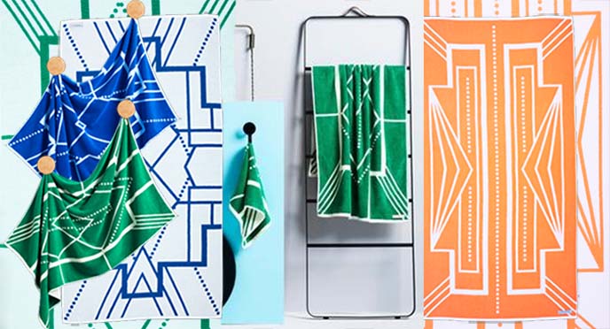
Sunday Minx has just released the new Deco District collection: it’s Gatsby glamour meets tropical chic!
Think Art Deco motifs and beachside architecture. These soft towels convey the warm, retro glamour of Miami’s famous hotels.
Sunday Minx is a designer full of energy, and I can’t wait to see what they release next. You can pick up various sized towels, bundles, bathmats and more from their site.
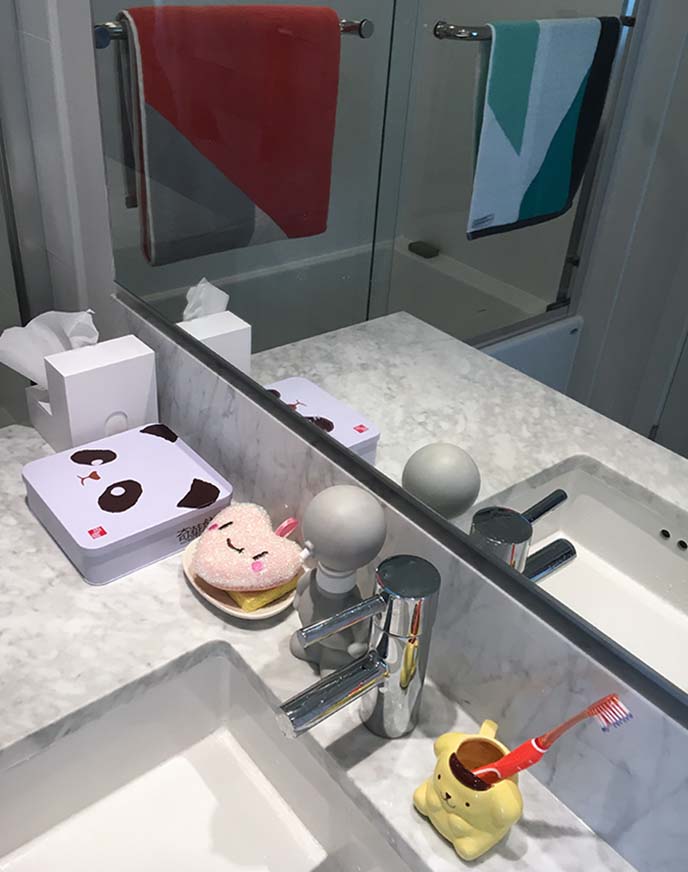
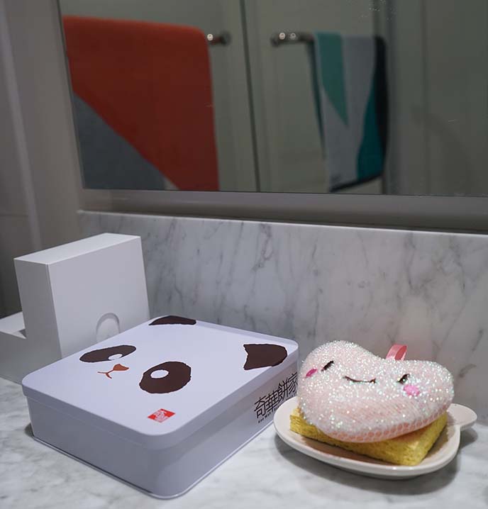
(Also in my bathroom: cute mementos from my trips. The panda box from Hong Kong holds small toiletries. I got the cute sponge and soap dispenser from Japan, and my toothbrush holder is a Pompompurin cup from the Harajuku theme cafe.)

To the bedroom. I stuck to my color scheme and mid-century modern geometry, with luxury bed sheets from Allem Studio.
I always get a solid night’s sleep with plenty of lucid dreams, thanks to my natural memory foam mattress from Essentia.
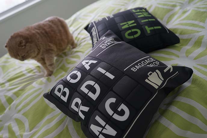
Remember the Airportag travel pillows from the living room? I have them on the bed too. The “Boarding” and “On Time” flipboards have a 1950s-60s feel.

The shelf above the bed is basically a shrine to Miffy the bunny. There are also statues from the cat temples I visited in Tokyo, Japan.

You’ve probably noticed I have a thing for white-colored cute characters, depicted in minimal strokes. The San-X pig, Monokuro boo, and Scandinavia’s Moomin are two more examples. They look especially cuddly on my organic, top-end memory foam mattress from Essentia.
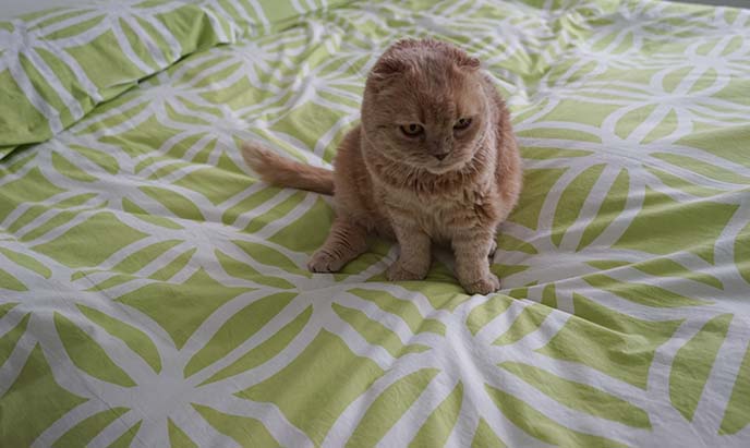
This fuzzy stuffed toy kitty is rather cute as well, no?
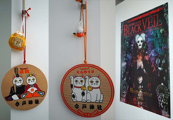
Inspired by Marie Kondo, I surrounded my bed with a few mementos from my favorite travel experiences. These include “omamori” from Japanese cat temples, and a poster from Osaka’s infamous Black Veil Gothic / occult party.
(Note: the apartment isn’t very “Goth-looking” in general, as a black / dark color scheme and Victorian-style furniture would make the space look smaller. But if you look closely, I have lots of dark accents throughout, such as a Ouija board tray, pentagram coasters, and leather fashion in the closets.)

There’s a lot of Miffy though! The recently deceased illustrator, Dick Bruna, created a minimalist icon that appeals to the imagination. In my universe, she’s the ruler of the dark underworld.
Above are a few examples of Dick Bruna’s genius. Amazing how he could depict a bunny peeking through a door, with the barest of strokes.

I’ve become enamored with Marie Kondo’s The Life-Changing Magic of Tidying Up and Spark Joy. For a year, I’ve been decluttering my life and selling most of my possessions here.
Above is a small collection of books (I mainly borrow from the library), with some Miffy mementos that make me happy.
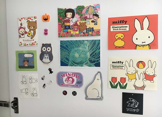
I also taped up some favorite stickers and mascots inside the closet doors. From the outside, there’s no visual clutter — but when I open the doors, I can see these images that “spark joy.”

Konmari has plenty of innovative ideas for keeping a house looking joyful and uncluttered. I took her advice on putting “ugly” storage items inside pretty bags, with cleaning products hidden in the back.
I also chose “utility” items with an eye to design and color. Hence the heart-shaped hangers, Eero Aarnio watering can, green Method dish soap and sponge.

Kleenex boxes tend to be an eyesore, but I found a solution at Japan Trend Shop. They carry tons of creative Japanese products, including this Folio L-Shaped Tissue Box in four colors (black, brown, white, pink).
Designed by Hirohisa Shimura, the tissue dispenser has openings on both sides. It looks like an abstract art sculpture, and can also serve as a bookend. The compact box opens up, and it literally takes 20 seconds to refill (take a stack of regular tissues from a rectangular Kleenex box, place them inside the Folio).
Simple, functional, versatile, minimal: this is a a brilliant Japanese design for an everyday object.

My architect dad always agreed with the modernist principle of “form follows function.” I applied this philosophy to my interior decoration. The objects have aesthetic value, but are primarily chosen to fit the needs of everyday life.
Let’s end this long post with a recap of the items featured, and tips for making the most of small living spaces.

♡ Instead of a regular-sized couch, look for a loveseat like my Cavett from Crate and Barrel. Slim, minimal lines keep the sofa from looking bulky, and taking up too much visual and physical space.
♡ Use the same color family for spaces that flow into each other, such as the living – dining/work – kitchen areas.
♡ Choose modular furniture that can serve multiple purposes. Eg, my white armchair similar to this one can be rotated to create an extra seat at the table.

♡ First impressions matter. I replaced my basic entry mat with this Scandinavian Pappelina rug from Scandaffaren.
♡ Size and ease matter as well. A tiny welcome mat may not provide enough space for you to walk in and take off your shoes.
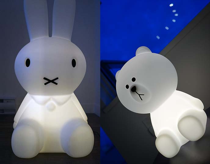
♡ Add mood lighting with minimal lamps that double as objects of art. My Miffy and Brown bear lamps are from Mr Maria‘s studio.

♡ Find home accessories that serve a purpose, but also showcase your personality and interests. The table light is shaped like my favorite mascot Miffy (it’s available here), and the Airportag pillows reflect my love of travel.
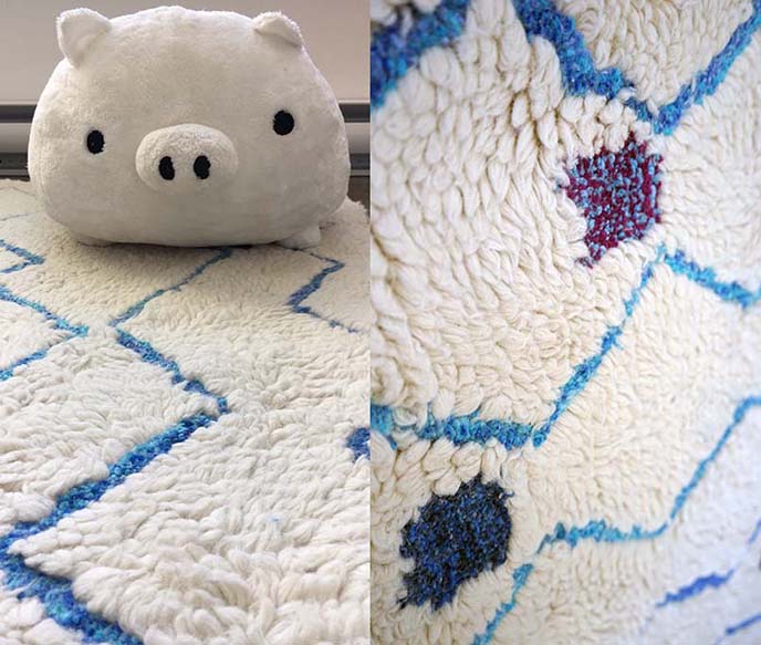
♡ A white or light-colored carpet can make the room feel bigger. My Moroccan shag from Rugs USA has zigzags that draw the eye towards the window, and soft tufts for texture.
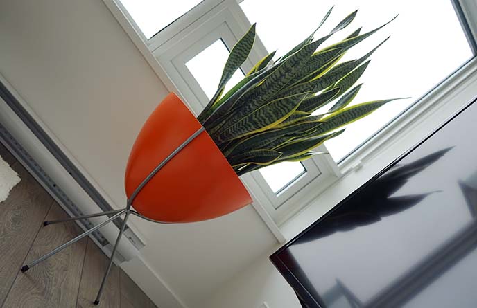
♡ Living plants are a must-have for a healthy home. Elevate them in colorful planters for a vibrant effect. My snake plant looks like a rock-star in the Retro Bullet Planter from Hip Haven.
♡ Look for bold, designer bathroom towels, like these geometric beauties from Sunday Minx. I use them daily, and they instantly transform a bathroom from drab to fab.
♡ Find fun, creative solutions for everyday objects. I replaced my Kleenex box with the Folio L-Shaped Tissue Container from Japan Trend Shop, found a happy-faced heart sponge, and put toiletries inside a panda box.

♡ Invest in a few standout pieces of top-end furniture. I got two Eames chairs and a table from Herman Miller, and I know they’ll last for life.
♡ Don’t be afraid of large pieces, if they can serve several functions. My Tavolo XZ3 table is great for all types of tasks, so I don’t need a separate desk or side-table.

♡ Look for furniture with thin metallic wire legs, like my Magis table and Eames chairs. They look like they’re hovering in space, which keeps the apartment from feeling small and weighed down.

♡ Avoid cluttered surfaces and excess decor, such as busy curtains and lots of pillows/accessories. Minimalism and Marie Kondo for the win!
♡ Keep kitchen utensils inside cupboards and drawers. For those that sit on the counter, go for a unified look (in my case, the microwave, toaster oven, and coffee/tea maker are stainless steel.)

♡ Commit to an overall style / era / aesthetic for the entire apartment. My mid-century modern direction is expressed through the colors (avocado green, tangerine orange, aqua blue), angled furniture legs, bullet planter, and geometric rug and towels.
♡ At the same time, experiment and make the look your own. I don’t want to live in a home that looks like a 1950s reproduction. I added personal touches such as Japanese kawaii, travel motifs, and art by my friends.

It took a long time to put my apartment together, and I’m thrilled with the results. I hope you enjoyed my interior design, and intimate peek into my home!
You’re welcome to Pin these images on Pinterest, and share this post on social media. If you have any questions or feedback, please leave a comment at the bottom and I promise to respond.
Thanks for stopping by my apartment! Now tell me or show me: what does your living space look like?
SHARE & COMMENT


 LA CARMINA


40 Comments
Stunningly done.
Thank you >
That planter, that sofa, all of it!!!
XXXXX
This is great. Mid century but your take on it for modern day.
Thanks!
Cute overloaded!
~_~
That bullet planter is on my goals list
It’s the best planter ever ahah!
Omgg to everything ❤️
<3
Where did you get the small triangle potted succulents ^-^?
Ahh, they’re from a local plantation (not a brand or available worldwide)… so I didn’t think there was any point to name the place, unless you happen to be in Vancouver! This look is pretty easy to recreate though – you can find cute little pots or even teacups, and put tiny Haworthia succulents in them. :)
Wow! Very impressive!
Cheers!
super cute!
ahh ive been waiting for this and it is as gorgeous as i hoped! best post!
Yay!
Thanks for sharing your home!
Thanks for visiting me!
it is GOALS…
amazing I love it
So cute ahhh goals!
^^
That is AMAZING!!!!
Thanks!
Your
place is gorgeous- and the polar opposite to mine, lol! I live on a
canal boat and my place is like a magical woodland indoors.
Sounds fab!
Ahh I love Miffy! You have a really cool place
:x Miffy madness!
so nice gadgets…… <3
http://7-sevendays.blogspot.it/
<3 <3!
bueno
Gracias!
I’m getting ready to move in a couple of weeks so this is really inspiring me to declutter and re-think my decorating style. I think I’ll always be a pack rack who plasters her walls with photos, posters, and artwork, but I do need to re-think my collection of knickknacks if I am to be getting a cat soon (gonna foster a cat to see if I’m allergic). Our new place isn’t carpeted so I’m definitely checking out Scandaffaren.
Ah, just saw this! Glad you enjoyed this :) I used to have posters / flyers pasted all around, but now I keep them inside the cupboard / closet doors (so they’re still there for me to see, while leaving the exterior minimal). Let me know how it goes with the new decor for your place! And YES Scandaffaren has a great selection on their web shop, have fun!
I love that you encourage people to stick with the original furniture pieces by designers – way to honor the artist! You’ve got a lovely space, and it’s a great way to show that MCM style works perfectly in smaller homes.
Nice blog… Please keep us informed like this…
that’s good