Shimokitazawa secondhand stores & vintage clothes: Tokyo hipster neighborhood, Japanese thrift shopping.

Shimokitazawa is a Tokyo district known for its vintage stores and hipster vibe. In this post, I’ll give you a tour of the best boutiques — including one that sells secondhand Gothic & Lolita clothing.

My lion t-shirt is from the I.T / Izzue store in Hong Kong. The image reminds me of my Scottish Fold kitty, Basil Farrow.

Met up with my Tokyo friends, Yukiro and Michelle. Their purple and blue coordinates happened to match.

Attempting an avant-garde pose underneath the subway tracks. Not sure if we succeeded.
Faux leather skirt: GladNews in Shibuya 109 (more photos from this shop soon)
Leopard print tights: from a random boutique
Silver stud ankle boots: Yosuke, from Shibuya 109

It’s easy to get to Shimokitazawa; the ride takes only 10 minutes by subway, from Shinjuku or Shibuya. “Shimokita” is a favorite hangout for Japanese youths, packed with retro anime stores, music shops, coffeehouses and second hand fashion.

We had lunch with Jake Adelstein, crime journalist and author of Tokyo Vice, a gripping memoir of his yakuza reporting escapades. Jake and I recently worked together on a TV show, but we can’t say much about it yet… lest we lose a finger!

Yukiro was so hungry that he began eating the flowers outside the Thai restaurant. (Tokyo in the spring is beautiful, isn’t it?)

After eating, we browsed the various secondhand stores in Shimokitazawa. This one had crates of old anime, manga and retro character goods. Michelle was tempted to get the Sailor Moon VHS tapes.

Gotta love Japanese programs for kids, which always leave you scratching your head in wonderment.

Not only young people live here… this neighborhood is a nice mix of residential and indie businesses.

Yukiro couldn’t stop laughing at the “Toy n Gay” stamp on the wall.

We all love Sailor Moon, crosses, spikes, and cats.


Upstairs, in the secondhand store Grand Bazaar, there were racks of Sweet Lolita fashion. Brands included Jane Marple and Justine et Juliette, which you can’t always find in Closet Child.

This intriguing boutique had Alice in Wonderland decor on the outside. But it was marked “Members Only,” so we dared not enter.

This thrift store looked like a repurposed bathhouse, and had a large selection of colorful sweaters, long skirts, and clothing from the 1970s and 1980s. Love the style of these two girls.
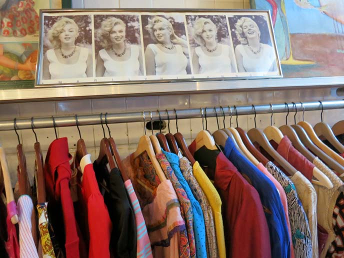
Marilyn Monroe overlooks a row of 70s-style tops. If you’re a fan of vintage shopping, you could spend all day here.

Haight & Ashbury is much-loved among treasure hunters. Items are pricier, but you’ll be sure to find high-quality, rare or designer pieces.

There’s an outstanding antique / dolly section, with faded lace and Victorian-style purses.

Shimokitazawa’s a fun place to spend the day, shopping and people-watching.

Be sure to bring your camera, stop for coffee or pancakes, and wander aimlessly.

You’ll be sure to stumble upon oddities, like this Doraemon (earless robot cat) store.

Or a skeleton playing a cello.

Have you heard of Shimokitazawa, or been to this Tokyo hipster neighborhood? Which are your favorite vintage stores?

And what do you think of our outfits in this post? Let us know below…
SHARE & COMMENT
Travel video: Art Deco Weekend 2013! The Betsy Hotel review, Miami restaurants & Ocean Drive.

Do the Charleston, the Charleston! I’m very happy with my latest travel video, about Miami’s Art Deco Weekend, now published on Huffington Post Travel.
This episode recounts my Miami adventures, from the Bettie Page fashion show to the flapper gala. Be sure to watch until the end, or you’ll miss the “jazz hands”!
I always appreciate your feedback about my work. If you’d like to see more alternative travel coverage, I’d be grateful if you can share my Huff Post article (or Like below):
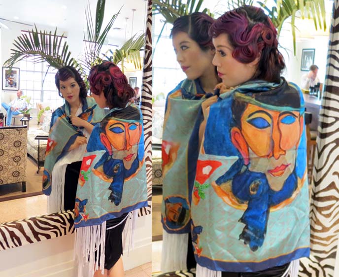
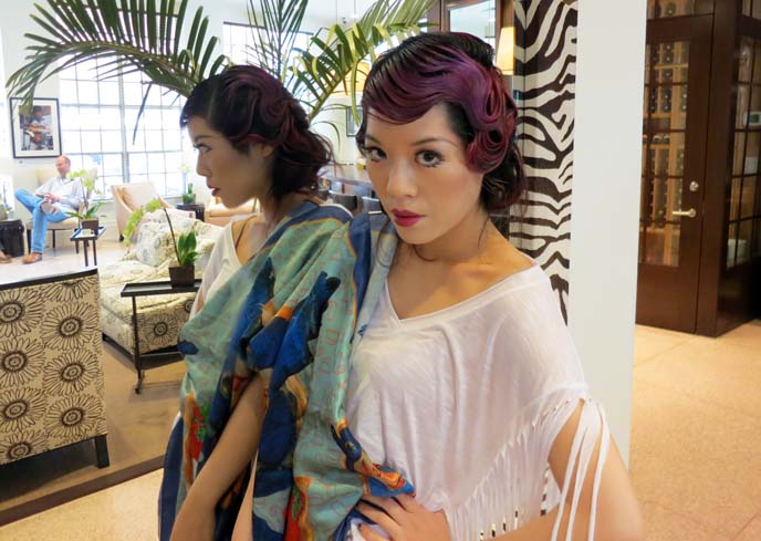
Shout-out to my collaborators for sharing my passion. I’m wearing a fringe top by Peace Love World, and a striking scarf with a face by Pitsart.
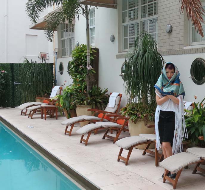
My host, The Betsy Hotel, is consistently rated one of the top in Miami, and I quickly found out why. The staff genuinely cares about your comfort; there’s an atmosphere of home here.
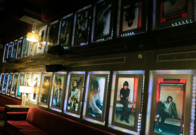
All around the hotel, there were intimate portraits of the Rolling Stones and The Beatles. The rock and roll lounge lit up a reflective film ceiling.
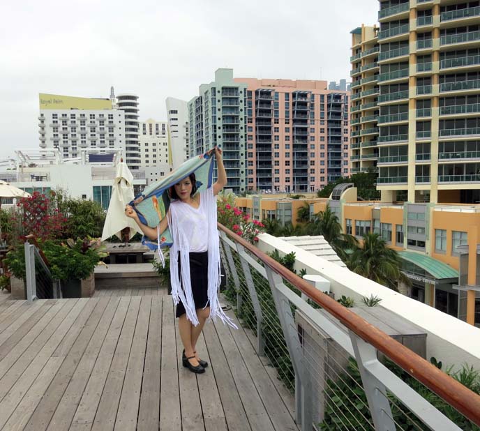
The rooftop garden overlooks South Beach (right across the road). The Betsy’s on Ocean Drive, but a few minutes walk from the main strip, so you’re not surrounded by noisy revelers. It was a perfect stay; I’ll be back.
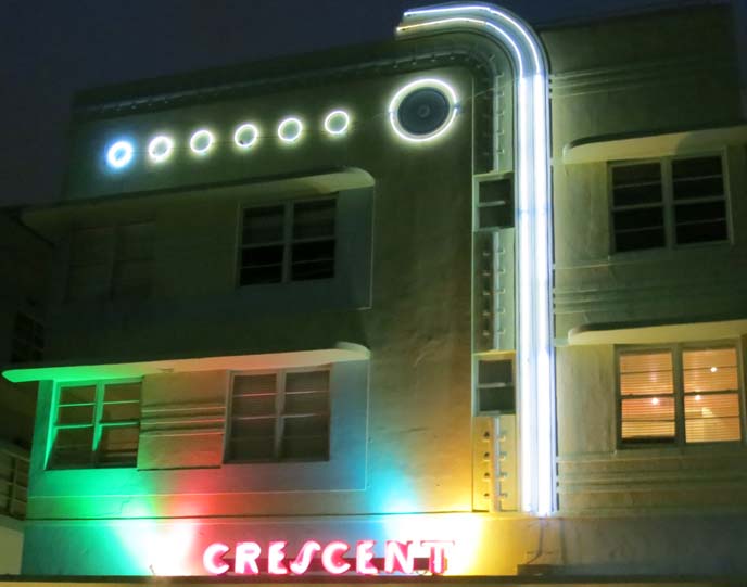
At night, Ocean Drive’s Art Deco hotels glow with neon.
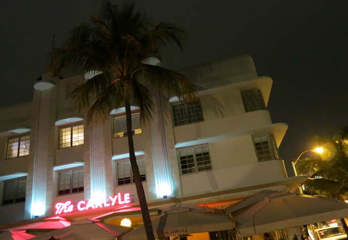
Do you recognize The Carlyle? It’s where The Birdcage movie was filmed.
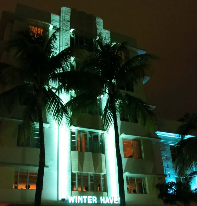
Miami’s a winter haven for many East Coast dwellers.
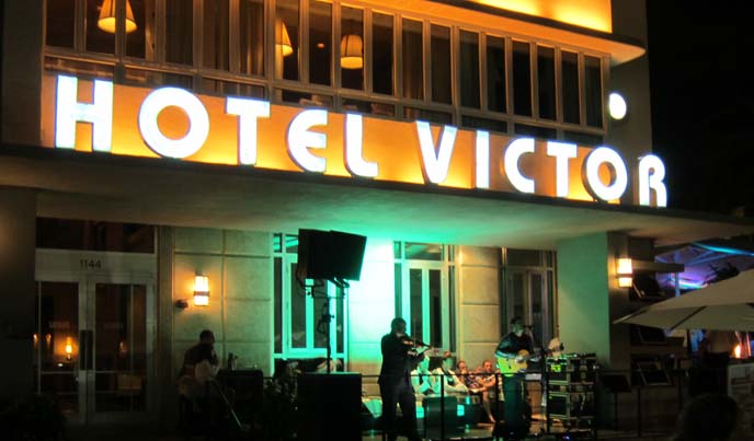
During Art Deco Weekend, there was live music all throughout the district.
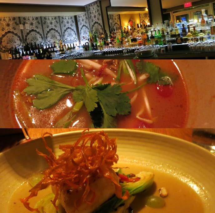
I’d be remiss if I didn’t mention the incredible seafood I had in Miami. Lantao Restaurant, located in the Kimpton Surfcomber Hotel, is inspired by Asian street food. I started with the “28 Days Later” cocktail: several types of rum (arr!) and house-made grenadine. Followed up with well-spiced tom yum soup, grilled paiche (South American tropical fish), and ended with pear cake — marvelous.

I mostly stayed in South Beach, but ventured to Coconut Grove to eat at Jaguar Ceviche. Six types of marinated raw fish on a spoon… mojitos… sangria… blue tortilla chips… grilled mahi mahi… is your mouth watering yet? Jaguar’s service and flavors were spot on, and the space is great for a big group.
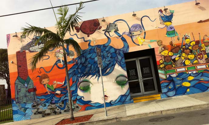
Wynwood Village is also a must-visit (although be careful at night, and in certain parts). It’s an artsy district with colorful murals like this anime one.
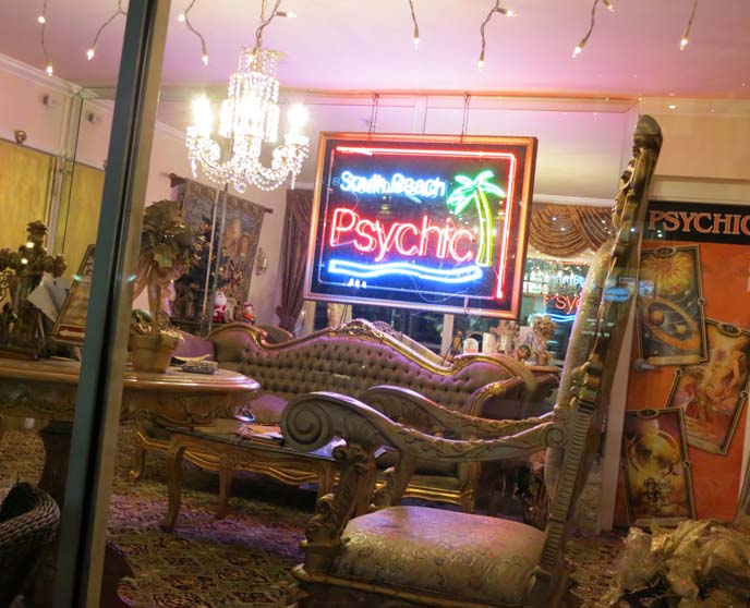
I think this psychic would predict my imminent return to Miami… hopefully in December, for Art Basel!
Please take a minute to watch my Art Deco Weekend video. Did you laugh at the dancing scenes?
What are your favorite hang-outs and shops in Miami? Would you be interested in seeing me cover Art Basel?
 LA CARMINA


